← work / 004
GovEagle
GovEagle helps government contractors win bids with AI. Its users live inside long RFP documents with hundreds of requirements. I came in as a freelance UI/UX engineer to make the AI's output easier to trust and faster to act on.
- Role
- Freelance UI/UX engineer
- Timeline
- Nov 2024 – Jan 2025
- Client
- GovEagle · Y Combinator
- Stack
- Figma, React
My role
- 01Reworked layout and visual hierarchy in Figma before building
- 02Designed and implemented responsive UI components in React
- 03Enhanced the PDF viewer with scroll-sync and intelligent highlighting
- 04Redesigned button placement, spacing and progress interactions
- 05Brought UX research practice from my Cornell UX Design certificate

key decisions
The product has changed a lot since early 2025, and the original files weren't kept, so the screens below are reconstructions drawn for this case study in GovEagle's colors and language.
01A PDF viewer that finds things for you
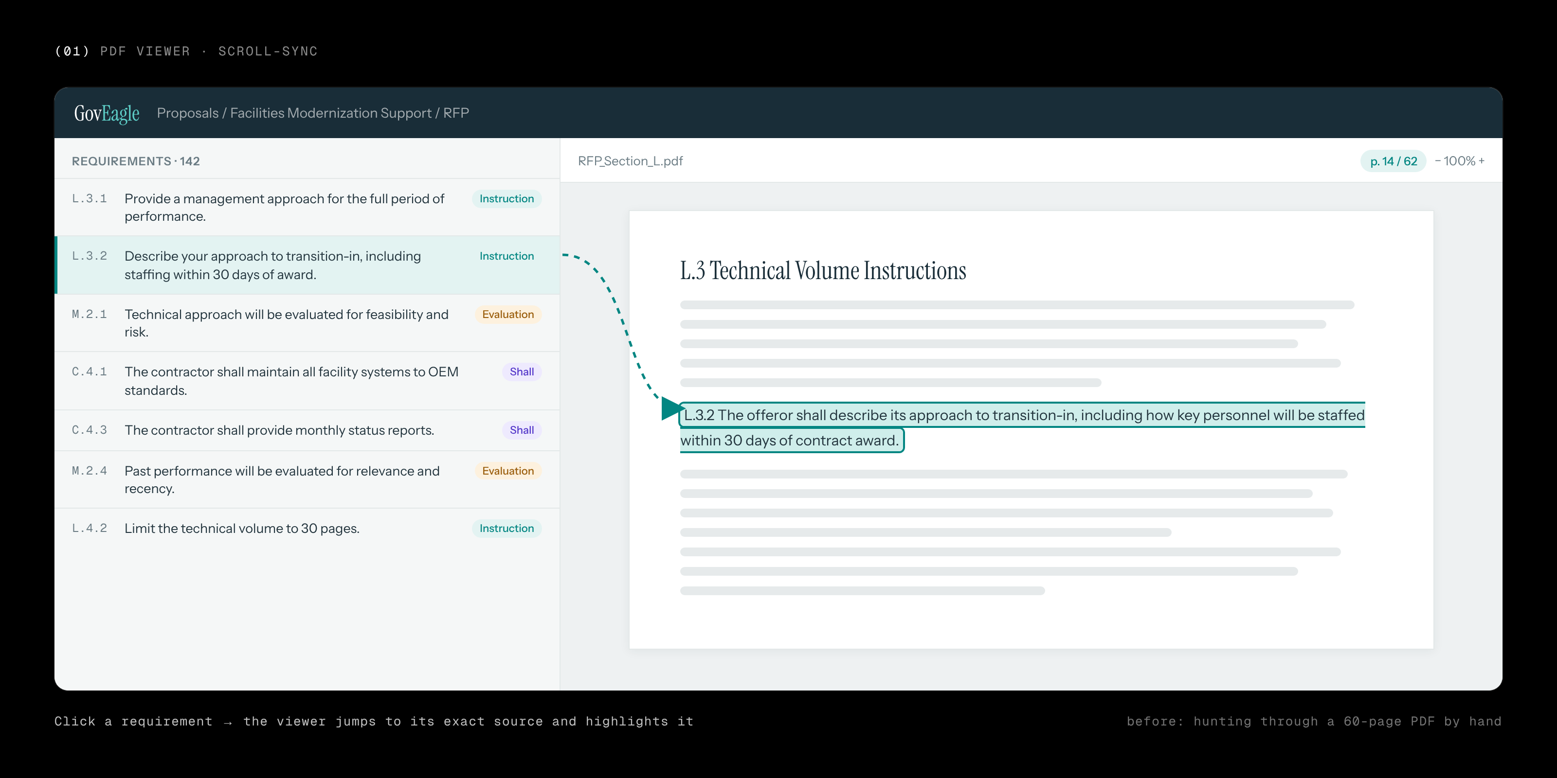
Proposal teams live inside 60-page RFPs. Clicking a requirement now scrolls the viewer straight to its source and highlights the exact passage, so nobody has to hunt for the sentence the AI is talking about.
02Color as a map, not decoration
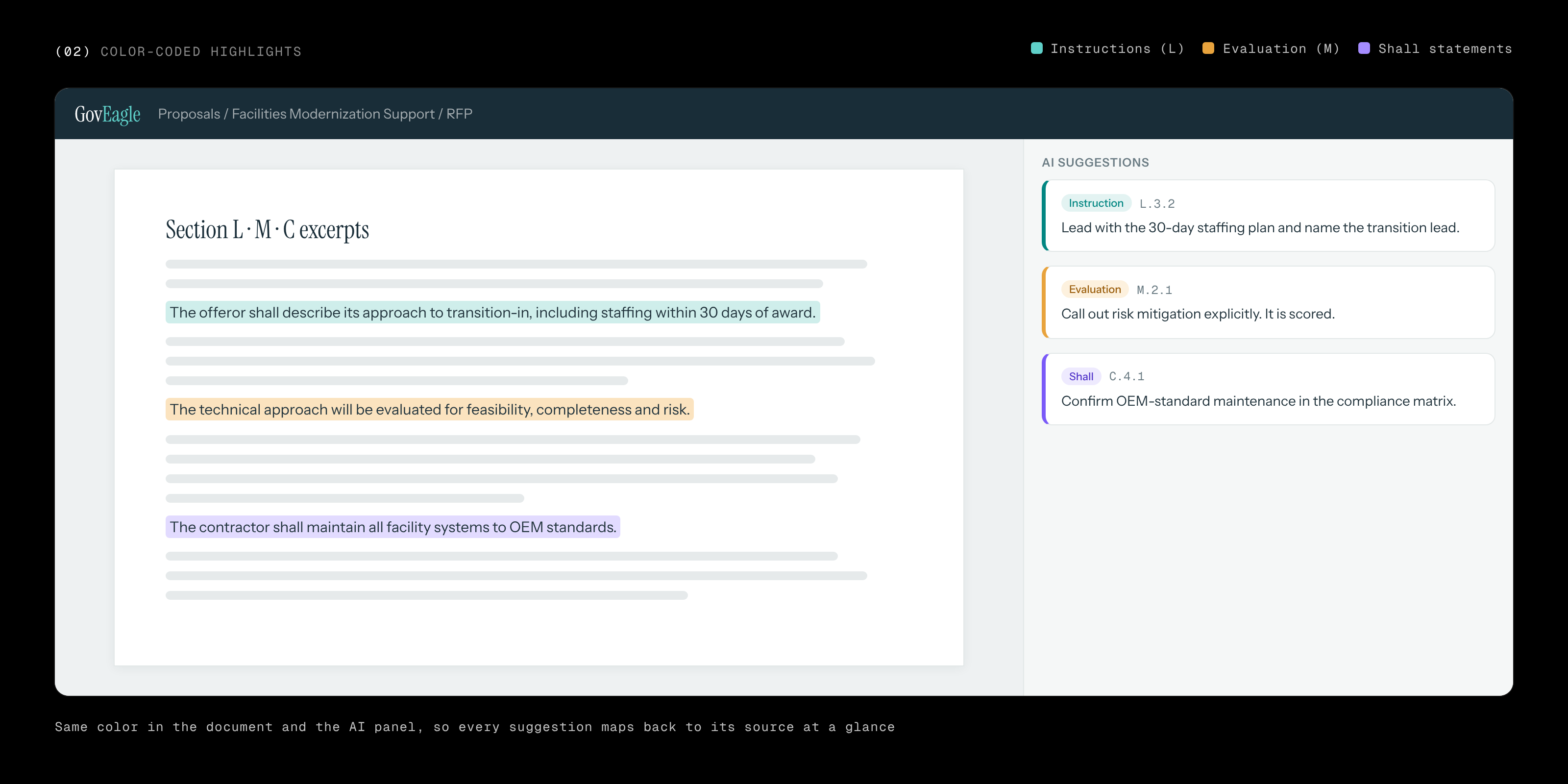
Instructions, evaluation criteria and shall-statements each got their own color, used identically in the document and in the AI panel. You can trace any AI suggestion back to the text it came from at a glance.
03Always know where you are, and what's next
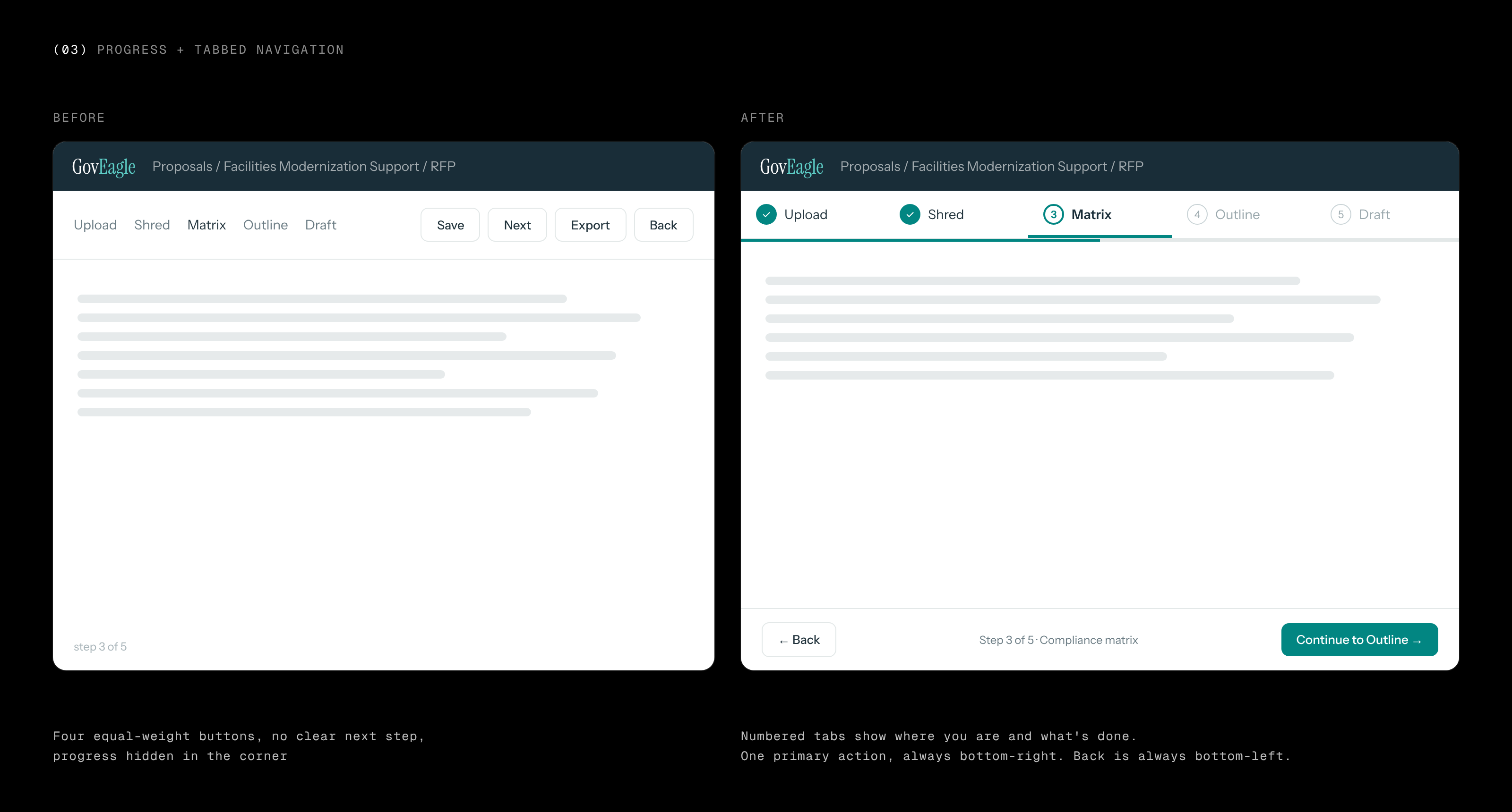
The workflow had equal-weight buttons scattered across the header and progress tucked in a corner. I moved it to numbered tabs that show what's done, a single primary action in the same spot on every step, and back always in the opposite corner.
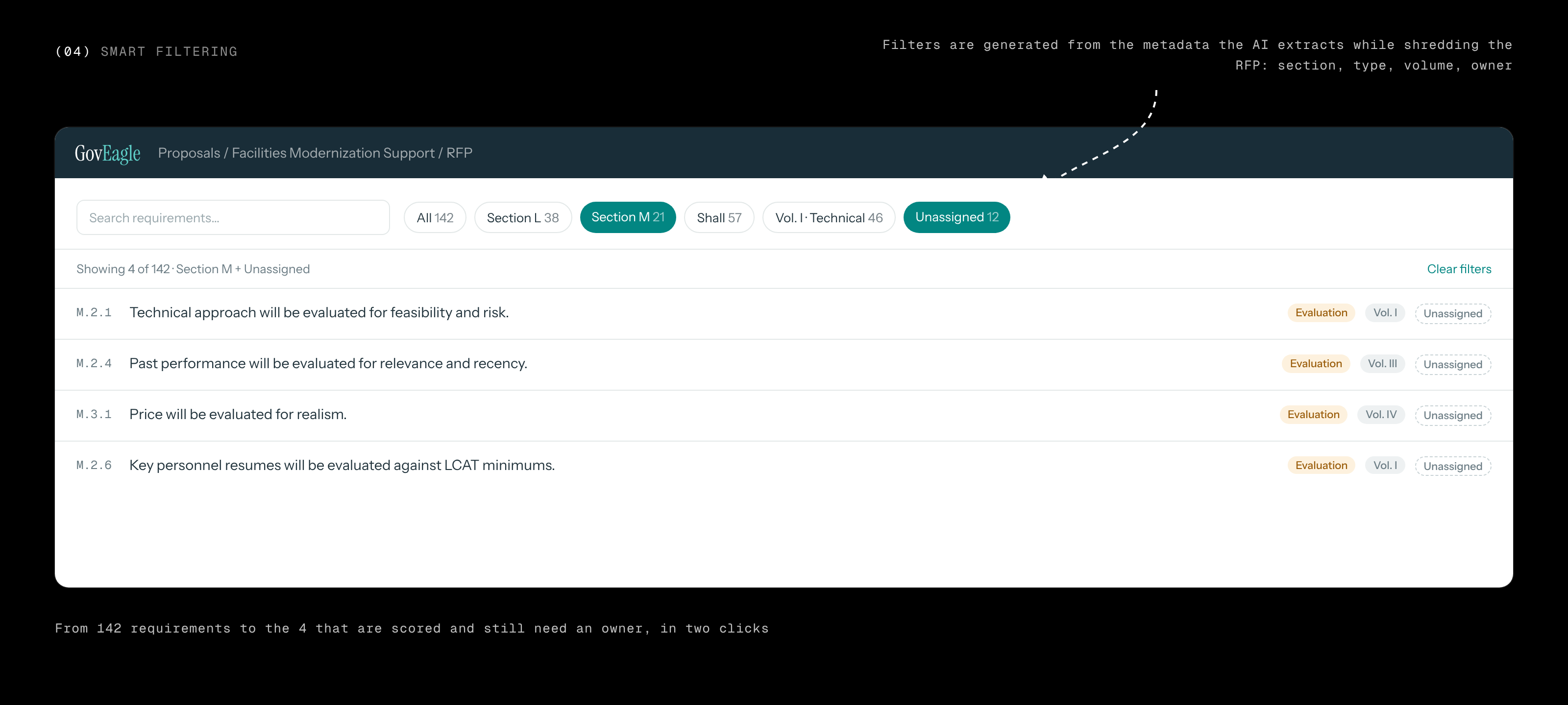
04Filters the AI already knew about
While shredding an RFP, the AI tags every requirement with its section, type and volume. I turned that metadata into filters, so a proposal manager can go from 142 requirements to the four that are scored and still need an owner in two clicks.
05Proposed: less on screen while you write
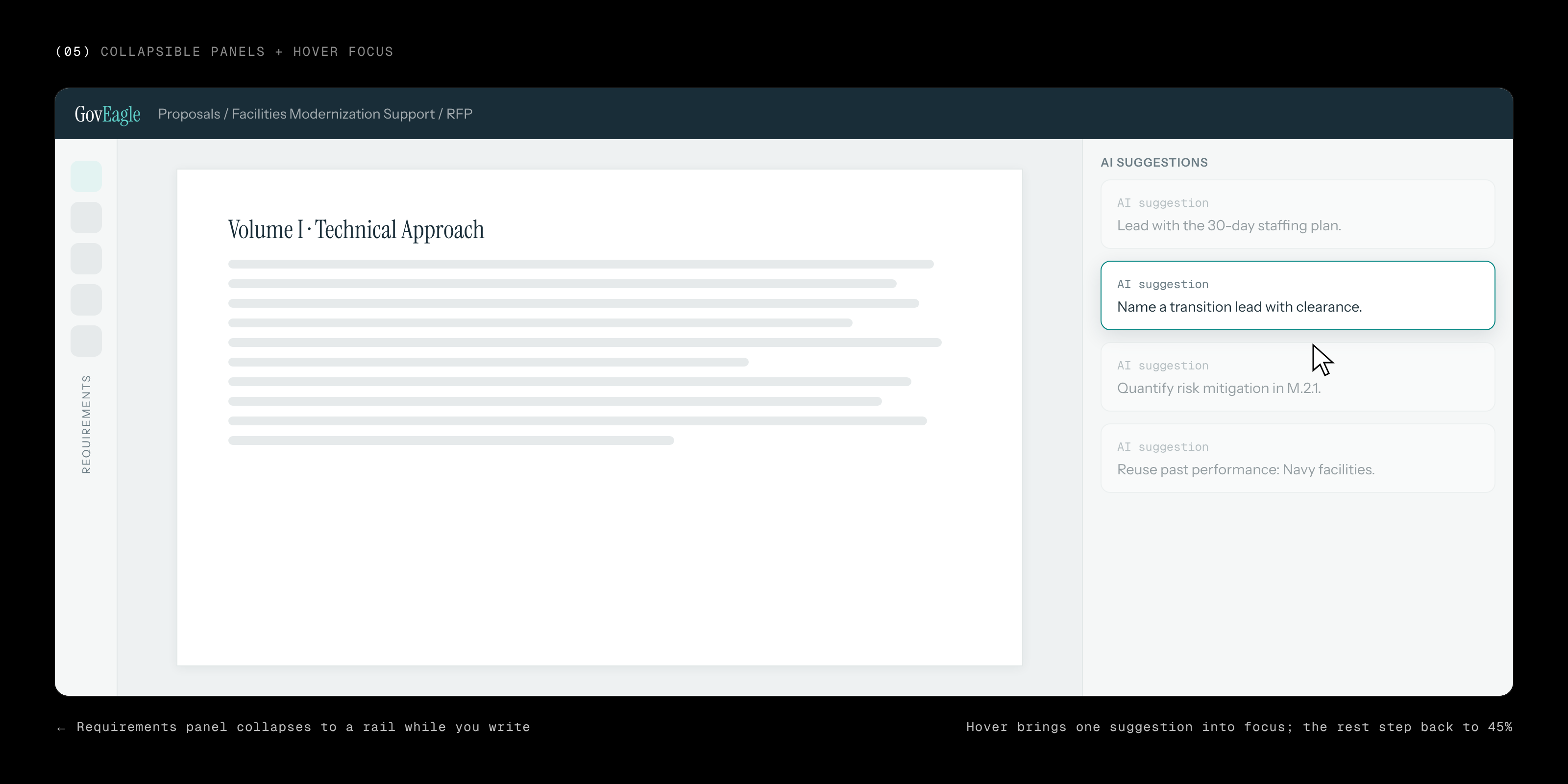
Three dense panels competed for attention while writing. I proposed letting the requirements panel collapse to a rail, and using hover opacity so one AI suggestion comes into focus while the rest step back.